Fan site (Harry Potter)
As part of the Web Design course, the assignment involved choosing an existing website, analysing its UX/UI structure, and then faithfully recreating it whilst radically changing its original theme. For this project, I selected the website of the water bottle brand Air Up and adapted its e-commerce and experiential design to apply it to the famous Harry Potter book series.
The main challenge was to retain Air Up’s dynamic layout, visual animations and ultra-modern shopping journey, whilst adapting the visual identity and content to create a high-end shop/showcase dedicated to the various volumes of the Harry Potter series.
My steps
- Analysis of the existing design (UI/UX audit): The first step involved dissecting the Air Up interface: analysing its grid system, its bold typography, the use of white space, and the way in which products are showcased in an immersive manner.
- Conceptual Reimagining & Moodboard: Once the structure was understood, I created a moodboard to facilitate the transition between worlds. How could the concept of ‘flavour pods’ and water bottles be replaced with magical books? I defined a magical and mysterious visual identity, unique to Hogwarts, whilst retaining the minimalist and striking aesthetic of the original site.
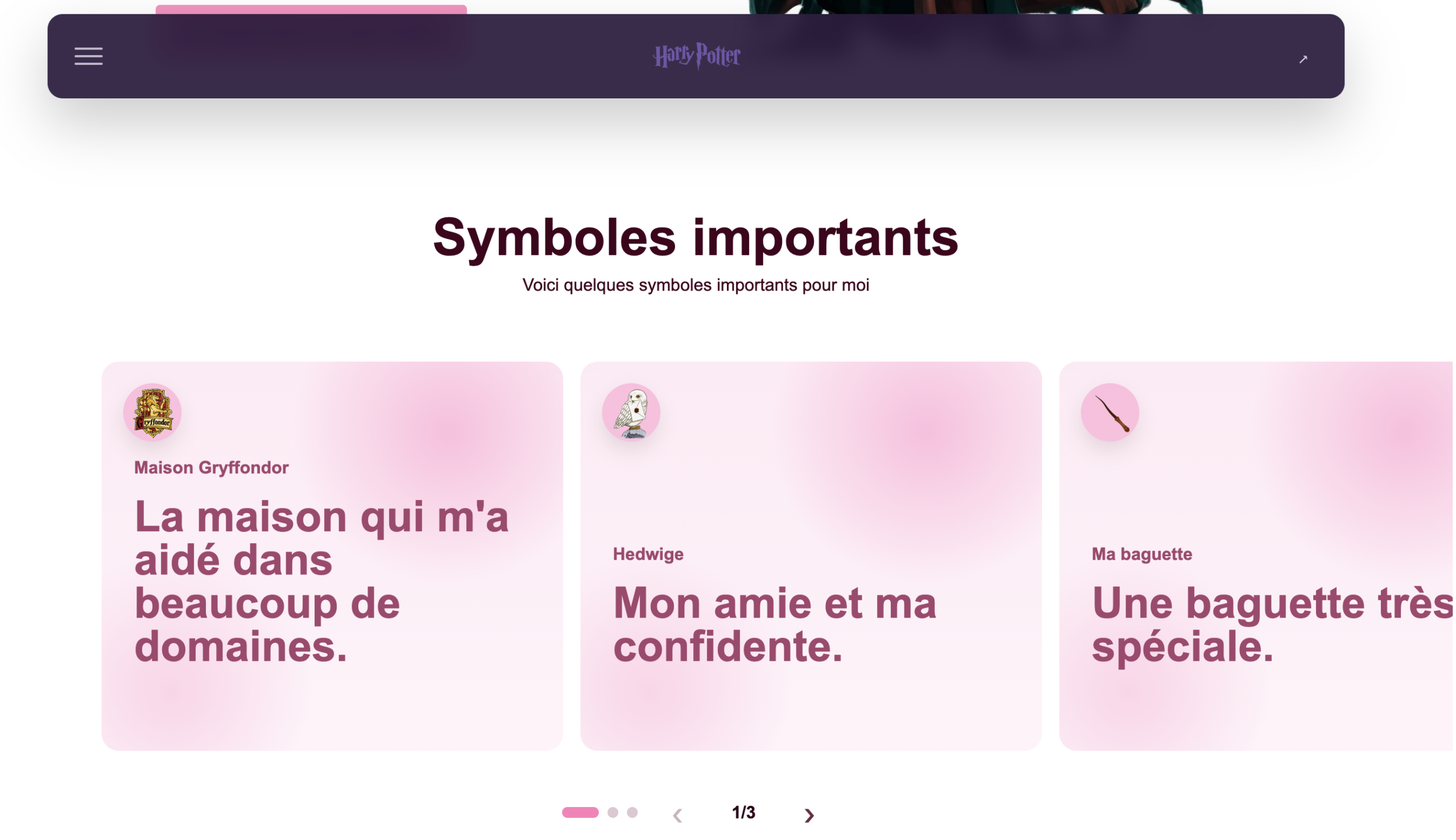
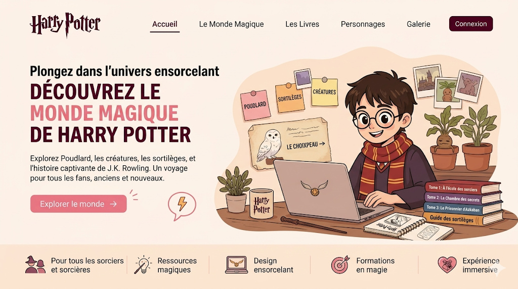
- Visual Design & Mock-ups (High Fidelity): When producing the mock-ups, I replaced the visuals of water bottles and fruit with graphic compositions featuring the various Harry Potter books. The hero banners and product pages were completely redesigned: whereas Air Up sells an olfactory experience, my site sells a literary immersion.
- Interaction Prototyping: I configured the prototype to replicate the behaviour of the reference site, notably the smooth transitions, the interactive ‘Add to Basket’ function and the dynamic scrolling that characterise the Air Up user experience.
My design
- Colour palette: I’ve moved away from the bright, vibrant tones of Air Up in favour of a darker, more enchanting colour scheme (Dark Mode), illuminated by golden touches and colourful accents specific to the different Hogwarts houses (Gryffindor, Slytherin, etc.), which make the book covers stand out.
- Typography & UI Elements: The layout retains large, bold headings and clean-lined action buttons to maintain the ‘trendy brand website’ look, creating a striking and very modern contrast with the fantastical theme of Harry Potter.
Key features
- The redesign of Air Up’s structure is built around key sections:
- The Event-Driven Home Page: A massive introductory banner that immediately grabs the eye, followed by immersive sections that present the book collection as if it were a cutting-edge tech product or a must-have lifestyle accessory.
- The ‘Packs’ System: Modelled on Air Up’s starter kits, I have devised exclusive bundles (e.g. the complete saga pack, the first three volumes pack, or collector’s editions).
- Revamped Product Pages: Streamlined presentation pages where each book is treated as a unique item, highlighting the synopsis, publication year and a quick-buy button.
Conclusion
This exercise in replication and adaptation was particularly instructive. It prompted me to understand exactly why an interface works visually and demonstrated to me that an excellent UX structure (such as that of Air Up) can be successfully adapted to a completely different context (the Harry Potter books) through meticulous work on the UI and brand storytelling.
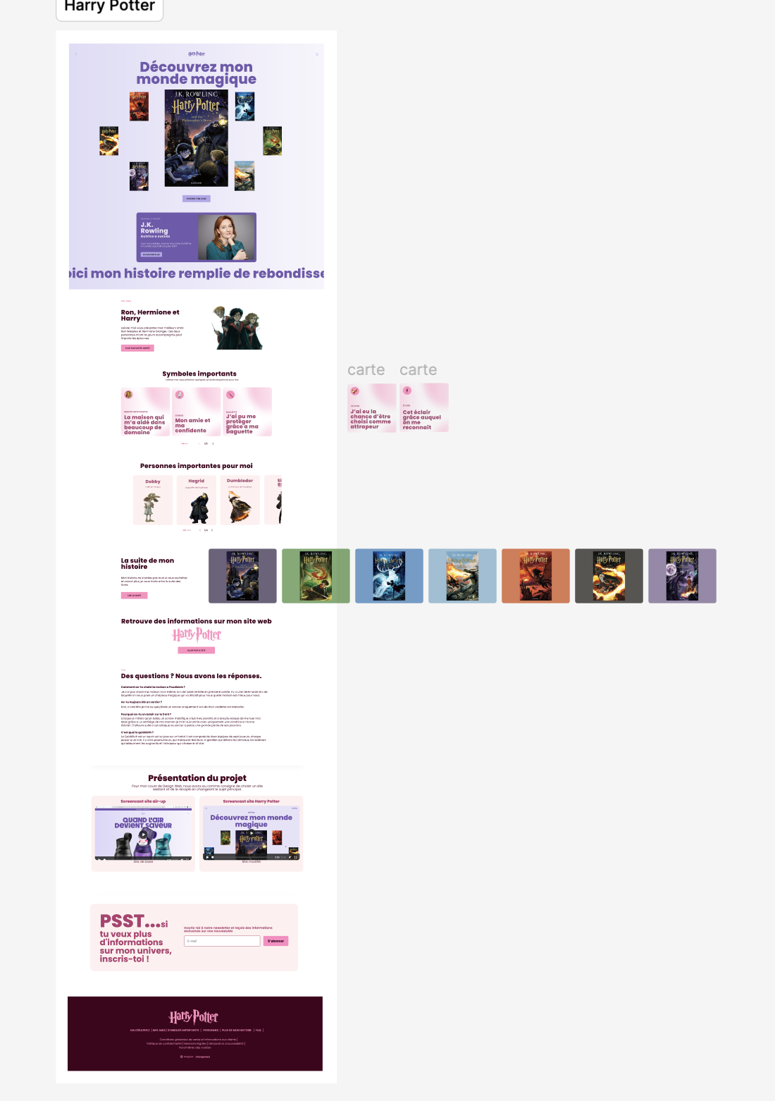
Gallery