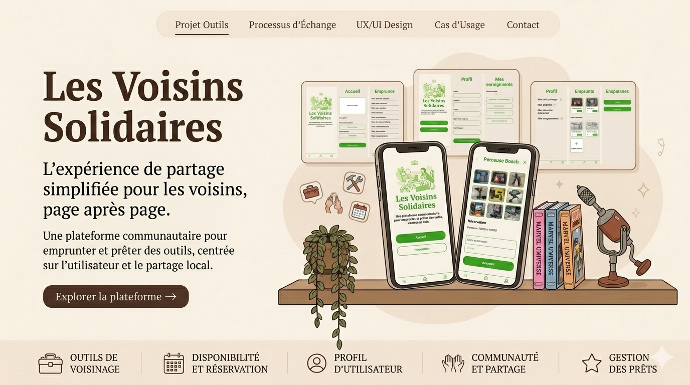
Neighbours helping neighbours
Developed as part of the Mobile App Design course, Les Voisins Solidaires is a collaborative mobile app focused on the circular economy and local mutual aid. It enables residents of the same neighbourhood to lend each other DIY tools and gardening equipment. The main UX challenge of this project was to design a platform based on trust, clear communication and the ease of booking items at a local level.
My steps
- Moodboard and Eco-Citizen Theme: To convey the values of solidarity, environmentalism and community, the moodboard phase focused on natural, minimalist and reassuring themes. The aim was to move away from the rigid conventions of traditional e-commerce to create a warm atmosphere centred on non-commercial sharing.
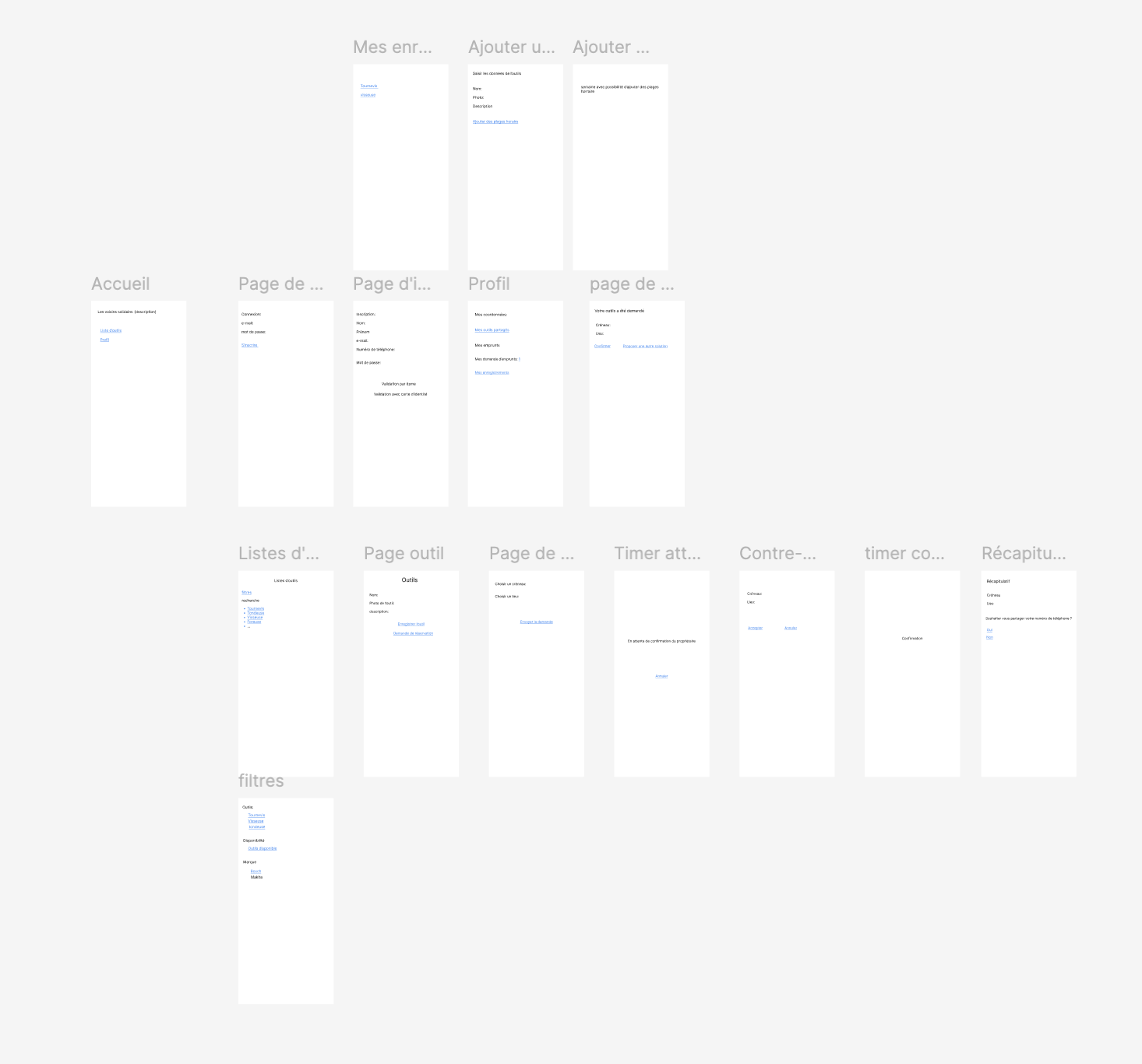
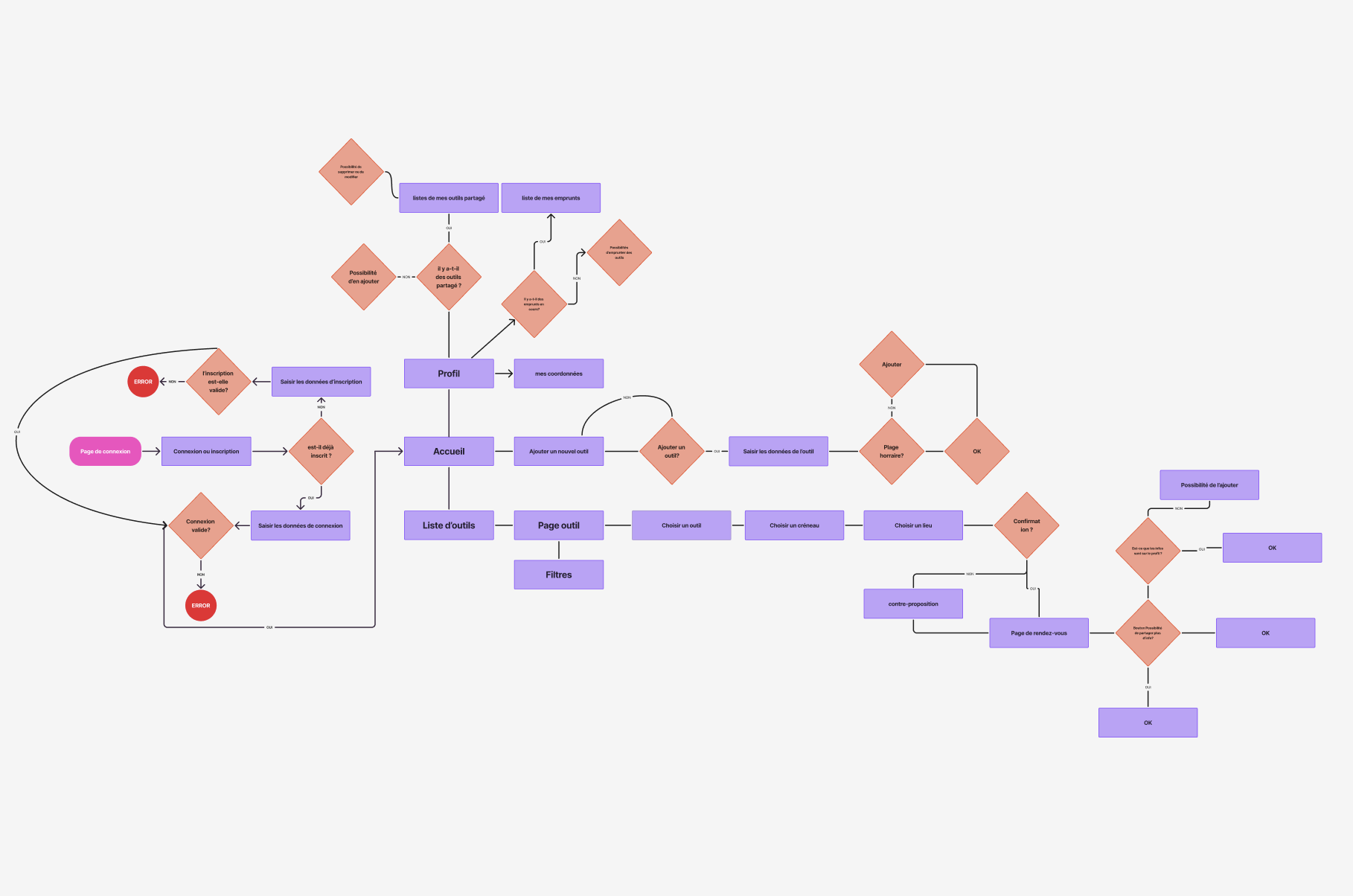
- Wireframes and Booking Journey (UX): The creation of wireframes enabled us to model a complex yet accessible calendar system for managing loan slots. I structured the application around asymmetrical journeys: the borrower’s journey (searching for and booking a tool) and the lender’s journey (managing their inventory and accepting requests).
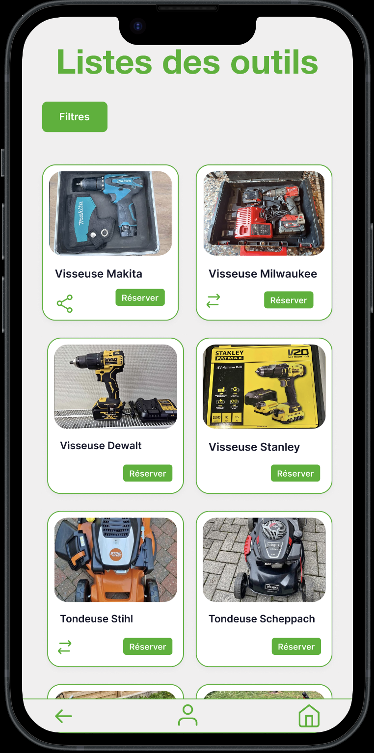
- Visual Design (High-Fidelity): During the transition to high-fidelity design, the focus was on the clarity of product pages (such as those for the Milwaukee screwdriver or the Makita leaf blower) and on the readability of booking statuses (pending, confirmed, counter-proposal).
- Prototyping: The prototype simulates the entire flow of a peer-to-peer transaction: from the initial filtering of tools available nearby through to the final booking confirmation screens, including the selection of location and time slot.
My design
- Colour palette: The interface features a bright, warm green as its primary colour, set against a luminous white background. This design choice directly evokes nature, gardening, environmental responsibility and a sense of community.
- Clean and Accessible Interface: Unlike previous projects, which were darker or more vibrant, the UI here focuses on clarity, with large, easily identifiable buttons and highly legible typography suited to an intergenerational audience (neighbours of all ages).
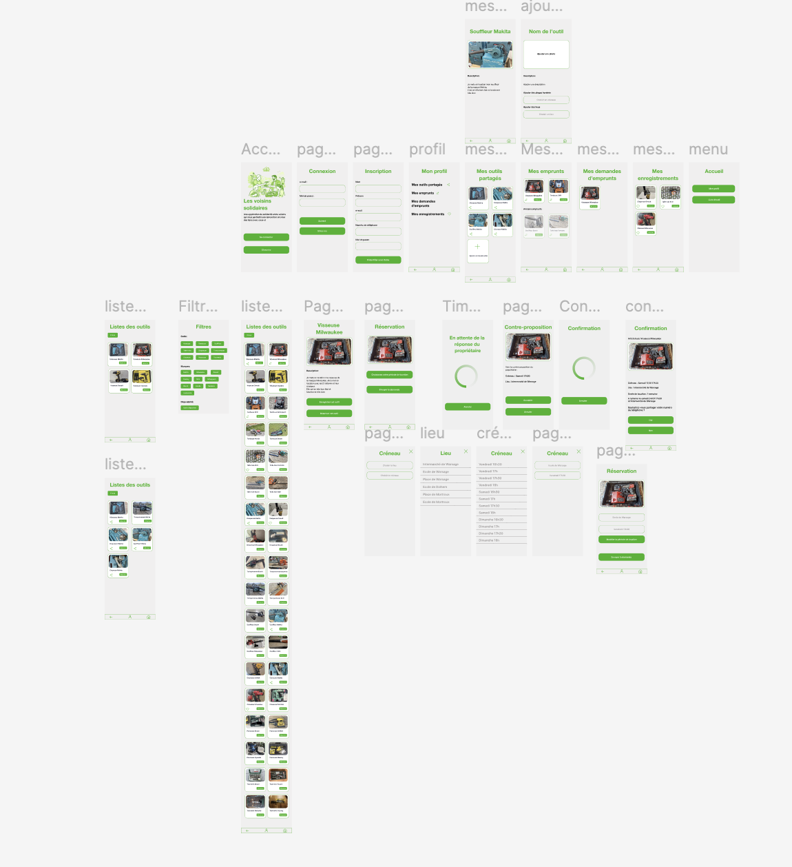
Key features
- Onboarding & Login: Clean, uncluttered screens for logging in, registering and setting up your ‘My Profile’ area.
- Equipment Management (Lender Side): A comprehensive dashboard allowing you to track ‘My Shared Tools’, add a new tool by attaching a photo and a description, and monitor borrowing requests received.
- Search and Filtering (Borrower Side): A “Tool Lists” catalogue page featuring an advanced filtering system by tool category, allowing users to quickly find the equipment they need.
- Collaborative Booking Funnel: The complete planning process, including tool selection, choice of time slot and meeting location, the screen for waiting for the owner’s response, the option to make a counter-proposal, and the confirmation screens.
Conclusion
This service application project gave me the opportunity to tackle ‘community’-oriented usability issues. Organising a flow of communication without financial transactions, focused on time management (calendars) and the management of personal inventories, proved to be an excellent exercise in functional UX.
Gallery