PLAI (customer website)
As part of my Web Design course, I designed the complete UI/UX mock-up for a website for an institutional client: the PLAI (Liège Centre for Support for Inclusive Education). The main aim of this project was to create a web platform that was informative, reassuring and functional, designed to support professional teams and schools in achieving greater inclusion for pupils.
The main UX challenge was to organise a large volume of educational resources and awareness-raising modules, whilst providing a secure, personalised space for members of the network.
My steps
- Client Needs Analysis & Moodboard: The starting point was to understand the role of the PLAI and its target audience (teachers, educators, school management). Through the moodboard, I sought to define a visual identity that moved away from a cold or purely administrative feel. The aim was to create a caring, human, warm and resolutely supportive atmosphere.
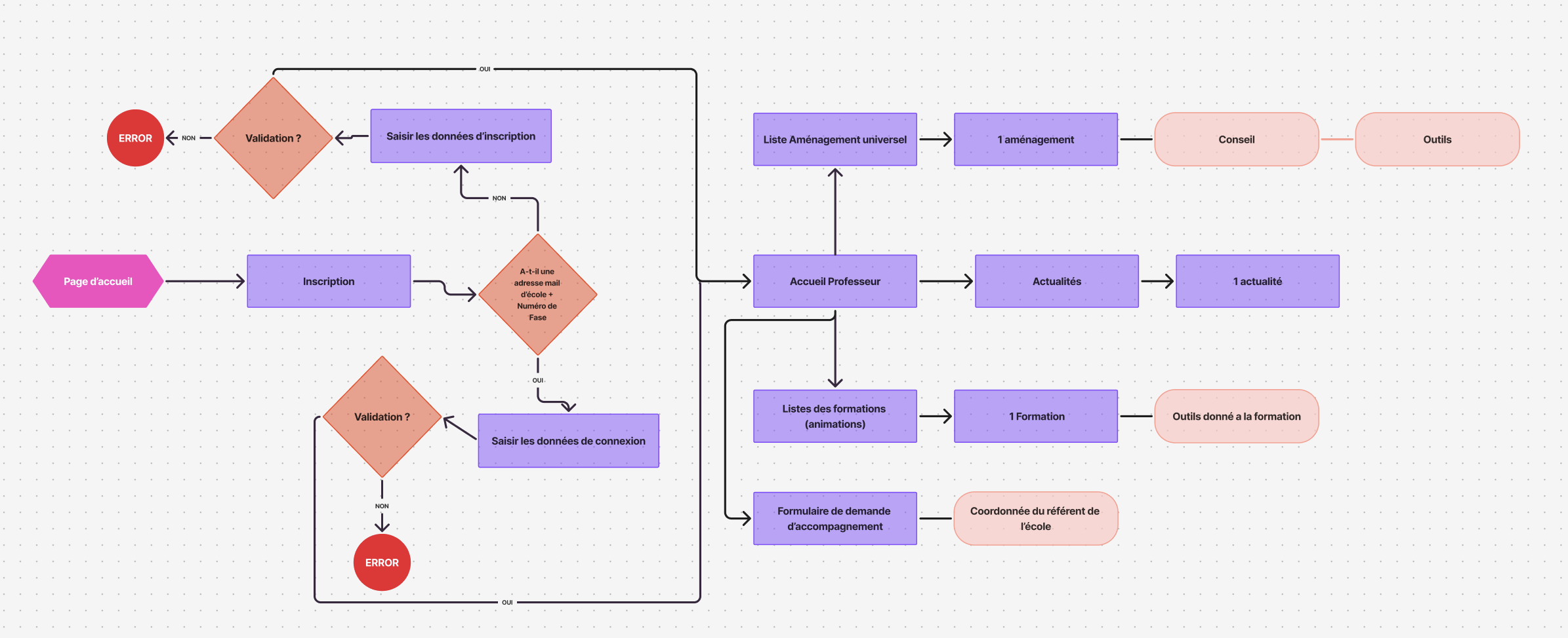
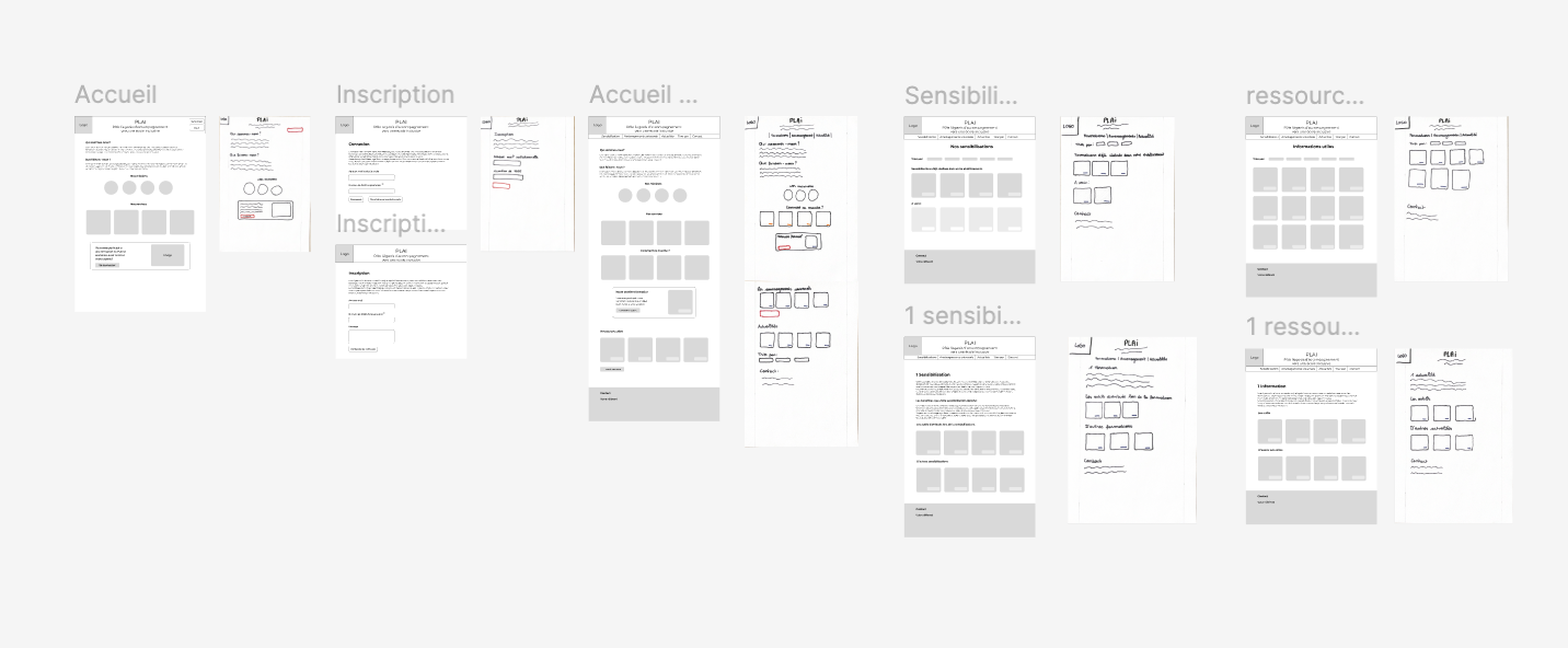
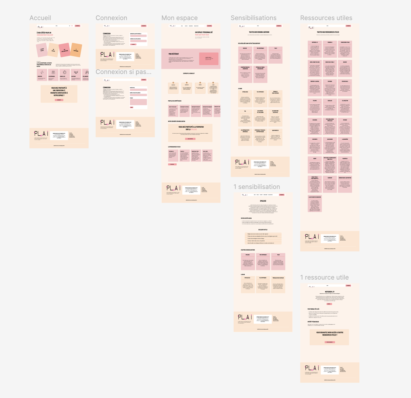
- Information Architecture & Wireframes (UX): Given the diversity of content (fact sheets on learning difficulties, teaching tools, directory), I worked on wireframes to simplify the search journey. I devised a system of clear card grids to organise the resources, making it easier for a busy teacher to scan the content quickly. A seamless authentication process was also designed for access to staff areas.
- Visual Design & Brand Guidelines (UI): During the transition to high-fidelity design, I adapted the content blocks using a system of coloured cards with rounded corners to segment the information without overloading the pages. Each type of resource or condition (Dyslexia, Dyspraxia, ADHD, etc.) is optimally legible thanks to carefully considered contrasts.
- Prototyping: The prototype simulates the user’s entire journey: from arriving on the homepage to logging into their personalised ‘My Account’ (with their dedicated advisor), right through to exploring a specific awareness sheet (e.g. Dyslexia) or a useful resource (e.g. LM Notebook).
My design
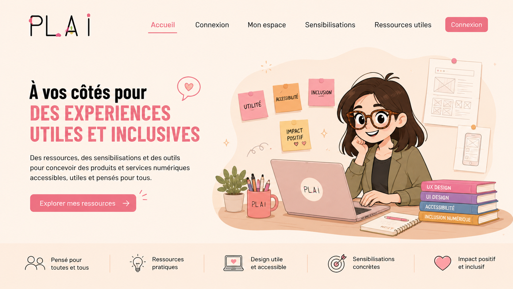
- Colour palette: The design features a very soft cream background, which reduces eye strain, combined with blocks of warm pastel colours (shades of salmon, powder pink and terracotta). This harmonious combination immediately conveys empathy, care and serenity.
- Typography & Accessibility: In keeping with the theme of inclusion, the choice of typefaces, font sizes and spacing has been carefully considered to ensure maximum readability, a crucial factor for a platform dealing specifically with reading difficulties.
Key features
- Home & Login: An eye-catching home page showcasing key figures, our mission (to inform, support, advise, etc.) and a clear call to action leading to the login portal.
- My Account (Personalised Area): A bespoke dashboard displaying your skills profile, recent training courses, related resources and direct contact details for your ‘personal advisor’.
- All Our Awareness Resources & Single Fact Sheets: A comprehensive catalogue of conditions (Dyslexia, Dyspraxia, ADHD, ASD, etc.) which links to detailed fact sheets including ideas for consideration and practical tools to implement in the classroom.
- Useful resources: A vast, searchable digital library featuring tool sheets (such as Eduaide.ai, Padlet, Quizizz) detailing their educational benefits and key features.
Conclusion
Working for PLAI has allowed me to apply the principles of web design to a project with a significant social impact. Combining the rigour of a detailed information architecture with a user-friendly, intuitive and accessible interface has been a particularly rewarding UX/UI design experience.
Gallery